PROJECT SUMMARY
Logo and identity design for a personal trainer with a background in martial arts and dance, and an interest in Chinese medicine.
• Brand strategy and demographic identification
• Logo design and visual identity
• Mock-ups
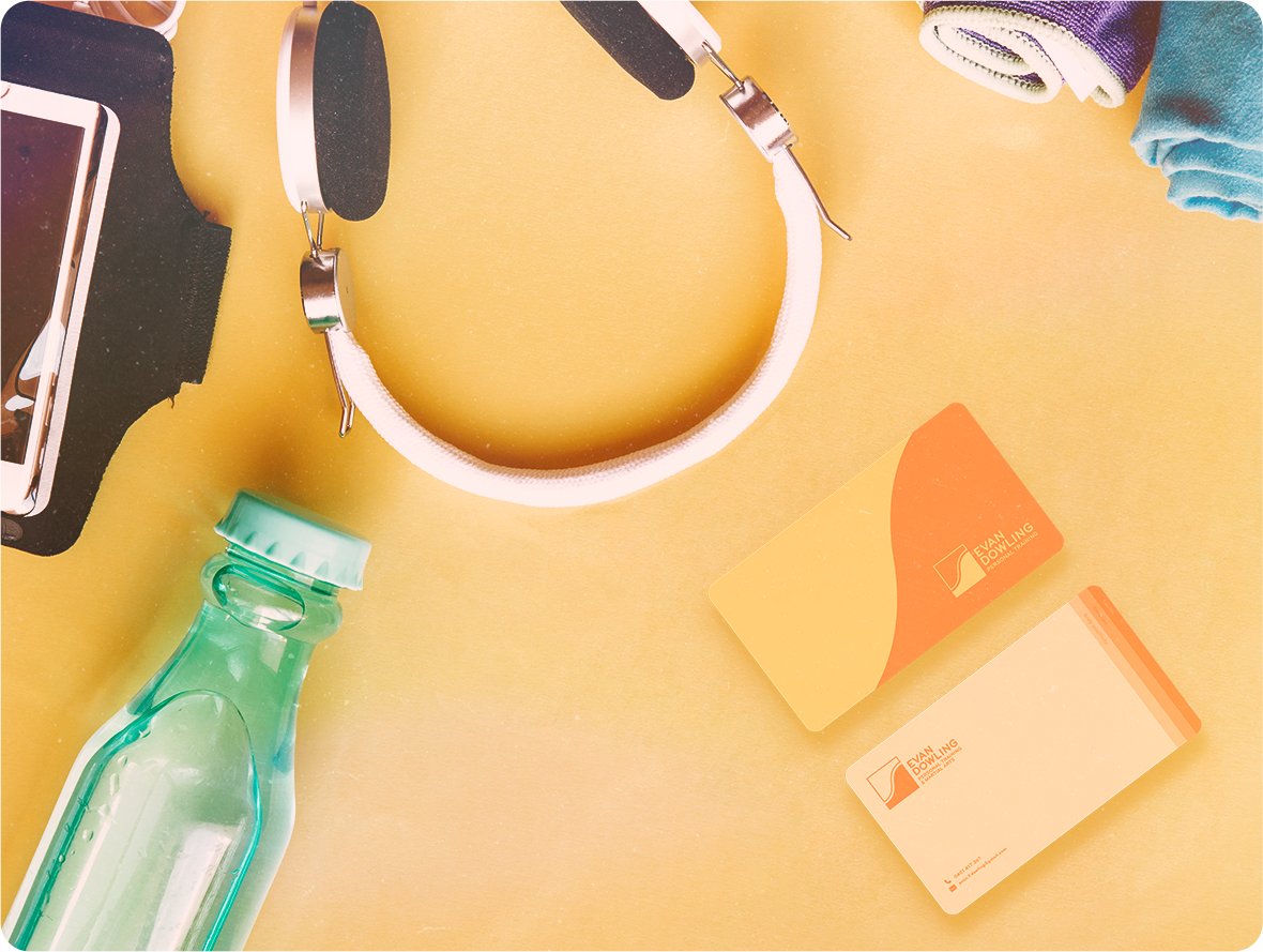
• Business cards
• Consultation
• Logo design and visual identity
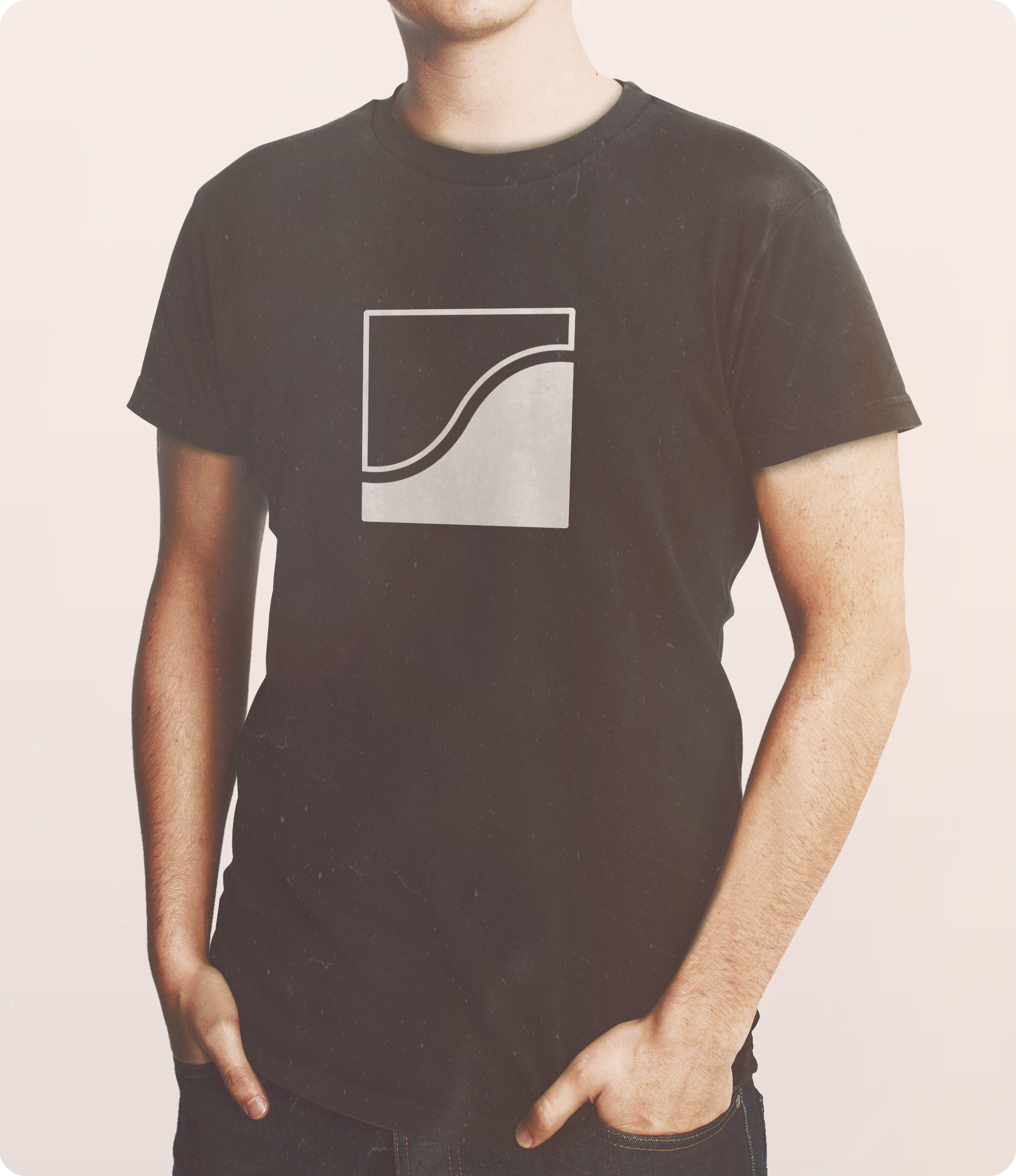
• Mock-ups
• Business cards
• Consultation

BRIEF
My client and I sat down and highlighted all the important aspects he wanted to portray with his brand and visual identity. Key to the client's ethos of personal training were mindfulness, body awareness and positivity, functionality, and overcoming limitations. The client's audience primarily included less experienced gym go-ers and women.
• Bold
• Welcoming/Friendly
• Slightly Martial
• Stable
• Welcoming/Friendly
• Slightly Martial
• Stable
LOGO DEVELOPMENT
We worked together to create a logo and visual identity that was welcoming, friendly and sturdy, while acknowledging the core principles of his business. It was also important that this identity could grow with the client as he expanded beyond personal training into martial arts training and self defense, as well as Chinese medicine.
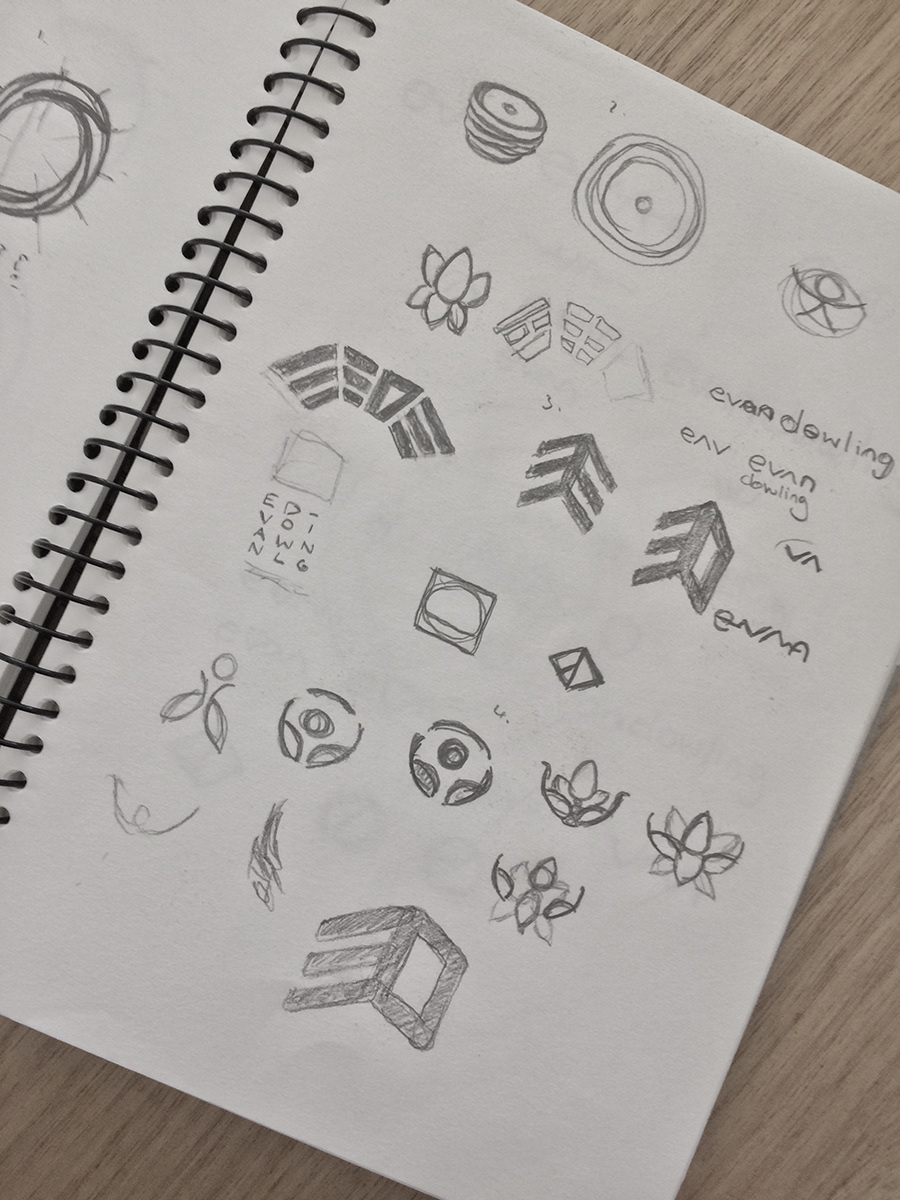
My process involved exploring key concepts in word maps to find abstract associations, as well as exploring visuals and styles associated
with Taoist iconography. I also explored some philosophical concepts of the tradition in my research.
with Taoist iconography. I also explored some philosophical concepts of the tradition in my research.

LOGO REFINEMENT
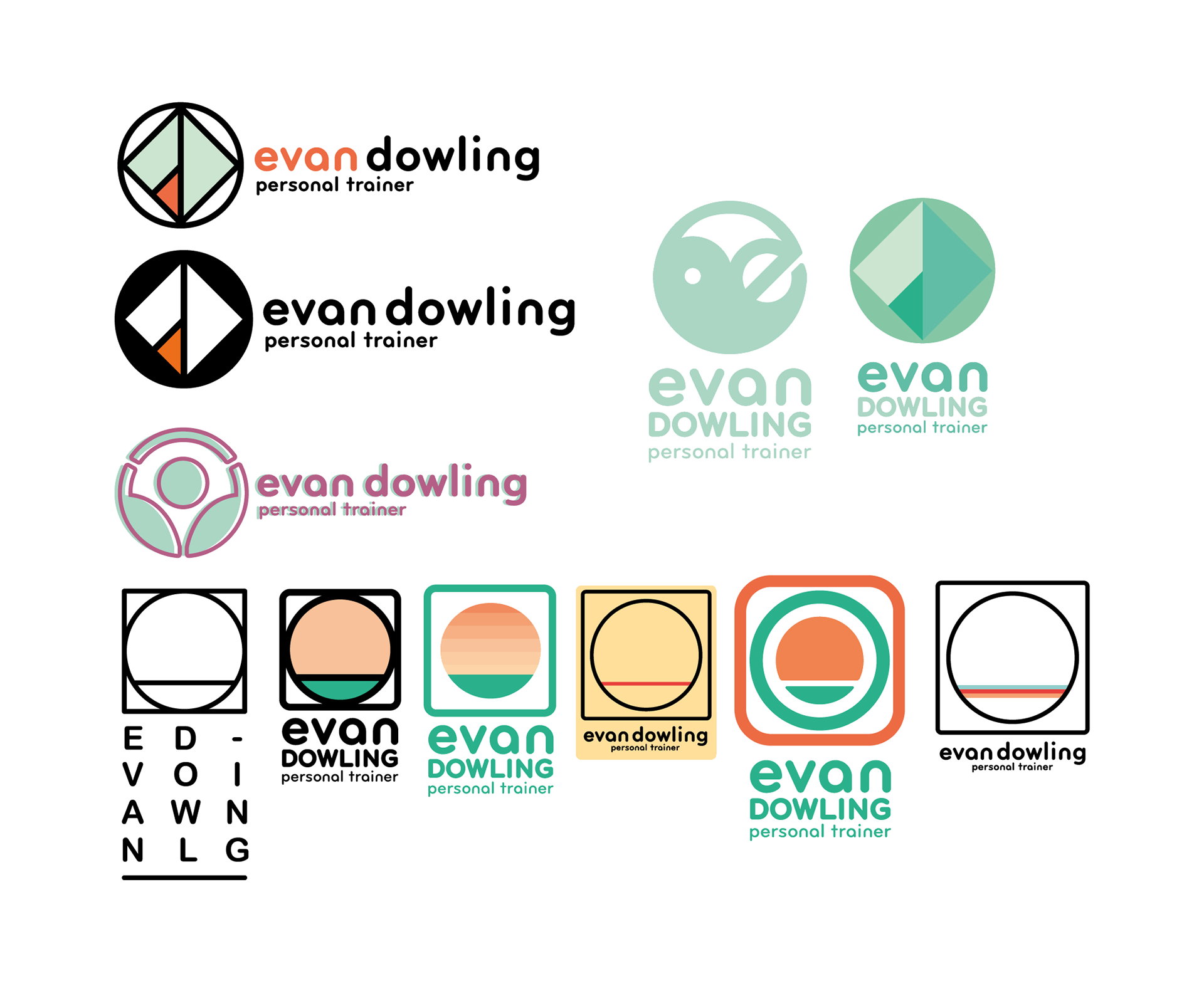
Together, we went through several rounds of iteration until we found the solution that best fit the brief and that stood out from his peers.
RESULTS
Evan was happy to finally have a visual identity to roll-out across exercise plans for his clients. He also begun to put together videos
with a friend using his new visual identity, demonstrating exercise technique for his clients.
with a friend using his new visual identity, demonstrating exercise technique for his clients.
I also consulted with Evan on how best to utilise his new visual identity system moving forward.

